Let's work together to tell your storyto build your brandto drink more coffee
We'd love to get to know you.
CW Print + Design is now CW Creative! Learn More

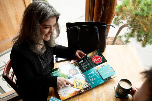
Great design isn’t just about making something look good—it’s about creating a visual experience that captures attention and drives action. That’s where the rule of thirds and the rule of three come in. These two powerful principles help designers and marketers craft print marketing materials that are both visually appealing and highly persuasive.
By understanding how these rules work together, you can create compelling designs that resonate with your audience and inspire them to take action.
The rule of thirds is a design principle that breaks an image into a grid of nine equal sections using three evenly spaced vertical and horizontal lines. The key elements of your design should be placed at the four intersection points where the eye naturally focuses.
This technique is widely used in photography, graphic design, and marketing to create visually balanced and engaging compositions. When applied to print marketing, it helps direct attention to the most important parts of your message.
For example:
By following the rule of thirds, your print materials become more engaging, leading to better readability and higher response rates.
Beyond design, persuasion plays a critical role in marketing. The rule of three is a principle in communication that suggests people find messages more engaging and memorable when presented in sets of three.
This works because the human brain naturally seeks patterns, and three is the smallest number needed to form a pattern. When marketers use three key points in their messaging, it creates a balance that feels complete without overwhelming the audience.
Consider these examples:
Using the rule of three makes marketing messages more impactful and increases their effectiveness.
By combining the rule of thirds and the rule of three, you can create print materials that not only capture attention but also persuade your audience to take action.
Here’s how you can apply these principles:
When designing flyers, brochures, or direct mail pieces, position key elements (such as your logo, headline, and call-to-action) along the grid lines or intersection points. This ensures your design is visually appealing and guides the reader’s eye effectively.
Use three key points in your headlines, bullet points, and calls to action. This makes your message clearer, more persuasive, and easier to remember.
Pair strong visual design with compelling messaging. For example, place a three-part message within a section of your design that aligns with the rule of thirds. This creates a balanced, engaging, and highly effective marketing piece.
By mastering the rule of thirds and the rule of three, you can create print marketing materials that not only look professional but also drive real results. Whether you’re designing postcards, brochures, or print ads, these principles will help you craft compelling and effective campaigns.
Ready to enhance your print marketing strategy? Contact us today to create visually stunning and persuasive print materials that make an impact!
We'd love to get to know you.